5 SwiftUI Button Designs Every SwiftUI Developer Should Know in 2023

SwiftUI gives you a variety of creative ways to create your buttons. Let's take a look at five that every SwiftUI Developer should know.
I'll also show you a bonus one design if you want to get extra fancy. 😃
Here are the buttons:

The Classic

Don't underestimate the power of the classic. It's simple and it immediately communicates to your users, "Hey, you can tap me and something will happen." That is when it has your apps accent color applied to it.
In this example, I'm using the gold color as my accent color. This remains consistent among all my buttons here.
Button("The Classic", action: {})
The Solid

The solid is a real attention-getter among your other buttons. You can use this style to make your buttons stand out among your other buttons. This style says, "Hey, I'm the obvious or recommended choice here. Tap me!"
Button("The Solid") { }
    .buttonStyle(.borderedProminent)
The Outline

This style has a refined look that doesn't stand out as much as the solid but still says, "Hey, I'm an option or your second choice if you don't like the primary option."
It can also be used when you don't want to pull attention away from the main content on your screen. It's more subtle than The Solid.
Button {
} label: {
    Text("The Outline")
        .padding()
        .background {
            RoundedRectangle(cornerRadius: 8)
                .stroke(.buttonGoldColor, lineWidth: 2)
        }
}
The Image & Text

Images can go a long way helping your audience understand what the button means.
This style can be combined with the other styles to help users better understand the purpose of the button.
Button {
} label: {
    Label("The Image & Text", systemImage: "hand.thumbsup.fill")
}
The Translucent Background
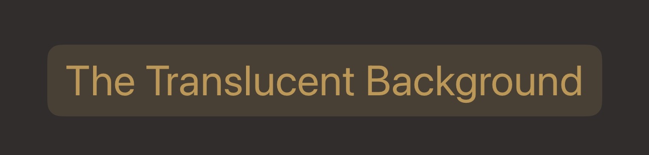
"Translucent" means to allow some light to pass through (trans: through, lucent: to shine) but not all the details of what is below it.
This is a great option when using buttons on top of images or videos. It prevents the button from getting lost in the content.
Button("The Translucent Background") { }
    .buttonStyle(.bordered)
// BONUS!
I wouldn't consider this next button as something every SwiftUI developer would have to know. But it is something you can play with and to produce just the right customized look for your app.
The Gradient

Now, this button says, "The developer took extra care to provide you with something special."
Don't go crazy with this one. It's easy to take it too far. In the screenshot above I show a thicker border so you can more easily see it but I would actually go a little thinner, like 2 points.
1. Define your gradient to use in your view but outside the body:
let gradient = LinearGradient(colors: [.buttonRustColor, .buttonBonusColor],
                              startPoint: .topLeading,
                              endPoint: .bottomTrailing)
2. Then in your body:
Button {
} label: {
    Text("The Gradient")
        .padding()
        .background {
            Capsule()
                .stroke(gradient, lineWidth: 2)
                .saturation(1.8)
        }
}
Saturation? What?
The colors in my color scheme are more muted, dull. I apply a little saturation to make the colors noticeable.
Where is the tint color?
You may have noticed that I'm not directly applying a tint color to every button.
Instead, I'm applying the tint to the top-level parent view. Any child view that uses tint colors will take on this property.
Now it's your turn!
Your mission, should you choose to accept it, is to combine two of the styles above and post it on Twitter.
Tag me @BigMtnStudio so I can retweet it and show it off to everyone. 😃
Free SwiftUI Picture Book

Screenshots for every code example? Yes! Get your FREE SwiftUI picture book here.