- Apr 22, 2024
How to customize the background of NavigationStack in SwiftUI in 2024
- Mark Moeykens
- SwiftUI
In this post you will learn:
How the NavigationStack changed
How background colors affect the NavigationStack
How to set a custom background color for the NavigationStack
How scrolling a List affects the NavigationStack
How to customize the NavigationStack when scrolling
How to set a custom font for the NavigationStack
Completely replace the NavigationStack with a custom view using safeAreaInset
How to use the toolbarBackground modifier to set the background color
Bonus: Using ZStack for a NavigationStack background
How the NavigationView changed
Starting in iOS 15, the background materials for bars (navigation bar, tab bar, etc.) were removed "giving more visual clarity to your content" as stated in this WWDC 2021 video titled "What's new in UIKit".
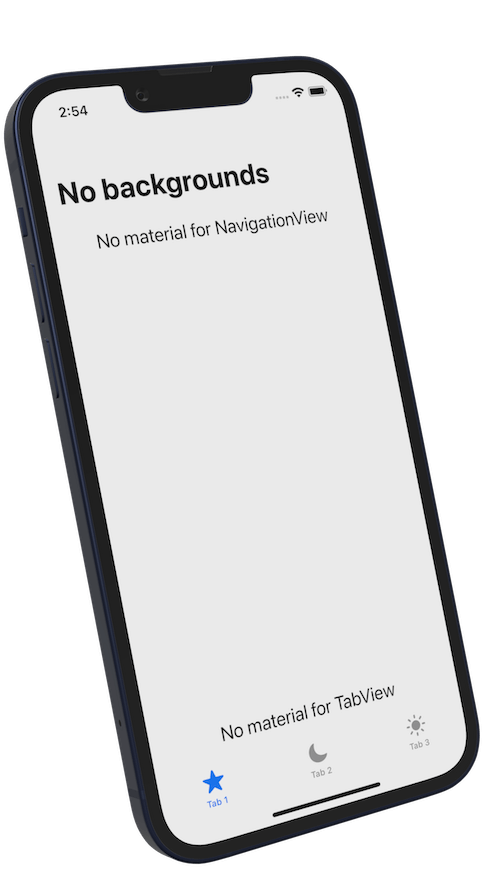
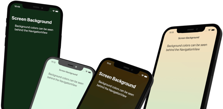
How background colors affect the NavigationView
When you set a background color, you will notice it will go behind the NavigationView for large and inline nav bars.
struct NavBar_ScreenBackgroundColor: View {
    let gradient = LinearGradient(colors: [Color.orange,Color.green],
                                  startPoint: .top, endPoint: .bottom)
    var body: some View {
        NavigationStack {
            ZStack {
                gradient
                    .opacity(0.25)
                    .ignoresSafeArea()

                VStack {
                    Text("Background colors can be seen behind the NavigationStack")
                        .padding()
                    Spacer()
                }
                .navigationTitle("Screen Background")
                .font(.title2)
            }
            .navigationBarTitleDisplayMode(.inline)
        }
    }
}
How to set a custom background color for the NavigationStack
In SwiftUI, starting in iOS 15:
The background of a view, such as shape styles, will automatically expand into the safe areas it touches.
When I say "shape style", I'm talking about styles that conform to the ShapeStyle protocol, such as:
Colors
Materials (blur effects)
Gradients
Hierarchical styles (secondary, tertiary, quaternary)
A new initializer introduced with iOS 15 allows backgrounds to expand into safe areas. You could manually set the safe area edge but by default, it is set to "all" edges.
Solid Colors
struct NavBar_BackgroundColor: View {
    var body: some View {
        NavigationStack {
            ZStack {
                Color.green
                    .opacity(0.1)
                    .ignoresSafeArea()

                VStack {
                    Rectangle()
                        .frame(height: 0)
                        .background(Color.green.opacity(0.2))
                    Text("Have the style touching the safe area edge.")
                        .padding()
                    Spacer()
                }
                .navigationTitle("Nav Bar Background")
                .font(.title2)
            }
        }
    }
}
Notice:
That Rectangle with the background HAS to touch the safe area edge.
The shape style (Color) is in a background modifier because the background accepts a "ShapeStyle" type.
The background touching the safe area edge should be the full width of the NavigationStack. The Rectangle shape expands horizontally to match the width of the device/NavigationStack.
Materials
You can use a Divider instead of a Rectangle. Let's combine it with a material this time:
struct NavBar_BackgroundColor_Material: View {
    var body: some View {
        NavigationStack {
            ZStack {
                Color.green
                    .opacity(0.1)
                    .ignoresSafeArea()

                VStack {
                    Divider()
                        .background(.ultraThinMaterial)

                    Text("Have the style touching the safe area edge.")
                        .padding()

                    Spacer()
                }
                .navigationTitle("Nav Bar Background")
                .font(.title2)
            }
        }
    }
}
This makes it look more like how NavigationStack used to look.
Gradients
Gradients are also a ShapeStyle type.
A vertical gradient doesn't work too well using this method because only the top color will bleed into the safe area.
Instead, use a linear gradient with some angle besides a vertical one.
struct NavBar_BackgroundColor_Gradient: View {
    var body: some View {
        NavigationStack {
            ZStack {
                Color.green
                    .opacity(0.1)
                    .ignoresSafeArea()

                VStack {
                    Rectangle()
                        .fill(Color.clear)
                        .frame(height: 10)
                        .background(LinearGradient(colors: [.green.opacity(0.3),
                                                            .blue.opacity(0.5)],
                                                   startPoint: .topLeading,
                                                   endPoint: .bottomTrailing)
                        )

                    Text("Have the style touching the safe area edge.")
                        .padding()
                    Spacer()
                }
                .navigationTitle("Nav Bar Background")
                .font(.title2)
            }
        }
    }
}
Notice:
The Rectangle has a height so it will add some padding to the bottom of the NavigationStack.
Because the Rectangle has height, I filled it with a clear color so you can see its background gradient.
How scrolling a List affects the NavigationStack
When you scroll up a List, the NavigationStack will automatically turn into the inline style with a material background:

But as soon as you try to customize the NavigationStack, you lose this feature.
For example:
struct NavBar_WithList: View {
    var body: some View {
        NavigationStack {
            VStack(spacing: 0) {
                Divider()
                    .background(Color.orange.opacity(0.2))

                ScrollView {
                    ForEach(0 ..< 15) { item in
                        RoundedRectangle(cornerRadius: 12)
                            .fill(Color.orange)
                            .frame(height: 44)
                            .padding()
                    }
                }
            }
            .navigationTitle("List & NavView")
        }
    }
}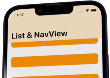
When you scroll up, the NavigationStack does not collapse inline. And the rows do not scroll behind the NavigationView.
For this to work, the List has to touch the NavigationStack.
So how can we customize the NavigationStack AND keep this behavior while scrolling?
How to customize the NavigationStack when scrolling
You will need to use the UINavigationBarAppearance from UIKit to customize the NavigationStack and keep the behavior when scrolling.
Example:
struct NavBar_WithListScrollBehind: View {
    var body: some View {
        NavigationStack {
            VStack {
                ScrollView {
                    ForEach(0 ..< 15) { item in
                        RoundedRectangle(cornerRadius: 12)
                            .fill(Color.orange)
                            .frame(height: 44)
                            .padding()
                    }
                }
            }
            .navigationTitle("List & NavView")
        }
        .onAppear {
            let appearance = UINavigationBarAppearance()
            appearance.backgroundEffect = UIBlurEffect(style: .systemUltraThinMaterial)
            appearance.backgroundColor = UIColor(Color.orange.opacity(0.2))
            UINavigationBar.appearance().scrollEdgeAppearance = appearance
        }
    }
}
With a UINavigationBarAppearance, you can customize all different aspects of the NavigationStack.
This code:
Sets a material (blur effect)
Sets a color
Assigns it to the scrollEdgeAppearance - Which you want to use when you have a scrollable view (like a List or ScrollView) touching the NavigationView.
Note: You can set these appearance properties in onAppear, the views init, or even in your App delegate when your app starts. It's up to you.
Here is the result:

Do you see the problem?
When the NavigationStack switched to inline (second screenshot), it lost the customizations!
The UINavigationBarAppearance allows you to customize different states or appearances of the NavigationStack.
So you need to apply the appearance you want to the standardAppearance of the NavigationStack:
struct NavBar_WithListScrollBehind_InlineToo: View {
    var body: some View {
        NavigationStack {
            VStack {
                ScrollView {
                    ForEach(0 ..< 15) { item in
                        RoundedRectangle(cornerRadius: 12)
                            .fill(Color.orange)
                            .frame(height: 44)
                            .padding()
                    }
                }
            }
            .navigationTitle("List & NavView")
        }
        .onAppear {
            let appearance = UINavigationBarAppearance()
            appearance.backgroundEffect = UIBlurEffect(style: .systemUltraThinMaterial)
            appearance.backgroundColor = UIColor(Color.orange.opacity(0.2))

            // Inline appearance (standard height appearance)
            UINavigationBar.appearance().standardAppearance = appearance
            // Large Title appearance
            UINavigationBar.appearance().scrollEdgeAppearance = appearance
        }
    }
}
Now it looks correct when scrolling up:

Completely replace the NavigationStack with a custom view using safeAreaInset
If you don't want to go into UIKit land and use UINavigationBarAppearance then you can create your own navigation view.
Using safeAreaInset, you can easily add a view to a scrolling view (List, ScrollView) and have the list scroll behind your custom navigation view.
Example:
struct NavBar_Replacement: View {
    var body: some View {
        NavigationStack {
            ScrollView {
                ForEach(0 ..< 15) { item in
                    RoundedRectangle(cornerRadius: 12)
                        .fill(Color.orange)
                        .frame(height: 44)
                        .padding()
                }
            }
            .safeAreaInset(edge: .top) {
                VStack(alignment: .leading, spacing: 8) {
                    HStack() {
                        Text("Custom Nav Bar")
                            .font(.largeTitle.weight(.bold))
                        Spacer()
                        Button(action: {}) {
                            Image(systemName: "wifi")
                        }
                    }
                    Text("With safeAreaInset you can create your own custom nav bar.")
                        .font(.caption)
                }
                .padding()
                .background(LinearGradient(colors: [.green.opacity(0.3), .blue.opacity(0.5)],
                                           startPoint: .topLeading, endPoint: .bottomTrailing)
                                .overlay(.ultraThinMaterial)
                )
            }
            .navigationBarHidden(true)
            .tint(.orange)
        }
    }
}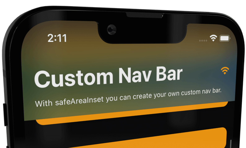
Don't forget to hide the NavigationStack (.navigationBarHidden(true)) when you add your own.
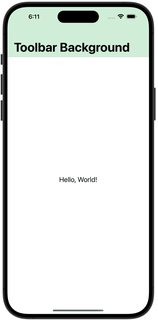
Using the ToolbarBackground Modifier (iOS 16+)
Starting in iOS 16, you can use the toolbarBackground modifier to set a style (color, material, etc).
struct NavStack_WithColor: View {
    var body: some View {
        NavigationStack {
            Text("Hello, World!")
                .navigationTitle("Toolbar Background")
                .toolbarBackground(.green.opacity(0.2), for: .navigationBar)
                .toolbarBackground(.visible, for: .navigationBar)
        }
    }
}
Notes
I could not get this method to work with gradients. 😞
Yes, you need TWO toolbarBackground modifiers for this to work. Maybe in the future, they can merge it into one or you can create a custom modifier that combines both.
Summary
You learned you can customize the NavigationStack in SwiftUI with the use of ShapeStyles that are set as backgrounds to views touching the safe area edge of the NavigationStack.
You also learned how to use UINavigationBarAppearance for customizations.
Finally, you learned you could hide the NavigationStack and create your own with the use of the safeAreaInset modifier on a scrolling view.
SwiftUI Views Quick Start Book
Do you need a SwiftUI visual reference guide?
You can download the SwiftUI Views Quick Start Book for FREE to get you started.

Bonus: Using ZStack for a NavigationStack background
Someone suggested using a ZStack and a separate shape style to create a background.
This is totally doable.
Here's how I did it:
struct NavBar_ZStack: View {
    var body: some View {
        NavigationStack {
            ZStack {
                Color.green
                    .opacity(0.1)
                    .ignoresSafeArea()

                // NavigationView Background
                VStack {
                    RadialGradient(colors: [.green.opacity(0.3), .blue.opacity(0.5)],
                                   center: .bottomTrailing,
                                   startRadius: 0, endRadius: 300)
                        .ignoresSafeArea(edges: .top)
                        .frame(height: 0)

                    Spacer()
                }

                VStack {
                    Text("Use a ZStack to put a background behind the Nav view.")
                        .padding()
                    Spacer()
                }
                .navigationTitle("Nav Bar Background")
                .font(.title2)
            }
        }
    }
}
Note:
You need to ignore the top safe area edge.
The frame height is ZERO in this example. Greater than zero will make it grow downward from the NavigationStack. Pretty interesting.
🌟 Special Offer: SwiftUI Enthusiasts to Save 11%! 🌟
As a thank you for reading our blog, we're thrilled to offer you an exclusive 11% discount on all our SwiftUI books!
📚 Use coupon code POSTS_11 at checkout or just click this link bigmountainstudio.com to claim your discount.
(Note: Coupons cannot be used during sales.)

Your Learning Path Quick Links (Save 11%)
Create UI with SwiftUI Views Mastery (beginner)
Architect your app using SwiftUI Essentials (beginner)
Improve your app's UX with SwiftUI Animations Mastery (junior)
Save & sync your app's data with Core Data Mastery -or- SwiftData Mastery (junior)
React to and manipulate data using Combine Mastery in SwiftUI (advanced)