SwiftUI ToggleStyle: Customizing the Toggle
Mark Moeykens
Mark Moeykens
Big Mountain Studio was started by Mark Moeykens. The company specializes in providing visual picture books to be used as a reference.

When it comes to customizing the SwiftUI Toggle's colors, we don't have a lot of options with modifiers.
And when we use the different ToggleStyles available to us, we don't really see much of a change.
Toggle("DefaultToggleStyle", isOn: $toggleState)
.toggleStyle(DefaultToggleStyle())
Toggle("SwitchToggleStyle", isOn: $toggleState)
.toggleStyle(SwitchToggleStyle())
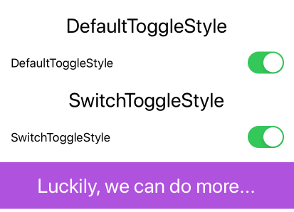
As you can see in the image above, there is no real difference here.
Creating Your Own ToggleStyle: Attempt 1
Unlike using ButtonStyle, you don't have access to the parts of the toggle, like the thumb (round circle) or the on and off colors.
To make it worse, you have to instantiate and return a whole new toggle. This doesn't really get you far:
To make it worse, you have to instantiate and return a whole new toggle. This doesn't really get you far:
struct PurpleTextToggleStyle: ToggleStyle {
var label = ""
func makeBody(configuration: Self.Configuration) -> some View {
Toggle(isOn: configuration.$isOn) {
Text(label)
.foregroundColor(.purple)
.fontWeight(.light)
.font(.title)
}.padding(.horizontal)
}
}

Creating Your Own ToggleStyle: Attempt 2
OK, you see you can return a new Toggle view, but is there anything else you can do? If you'll notice, the configuration parameter exposes the isOn property. This property tells us the current state of the toggle (true or false).
You can use this property to return something else that represents a true state and a false state. Maybe an empty square (false) and a square with a checkmark (true).
You can use this property to return something else that represents a true state and a false state. Maybe an empty square (false) and a square with a checkmark (true).
struct CheckMarkToggleStyle: ToggleStyle {
var label = ""
var color = Color.primary
func makeBody(configuration: Self.Configuration) -> some View {
HStack {
Text(label)
Spacer()
Button(action: { configuration.isOn.toggle() } )
{
Image(systemName: configuration.isOn
? "checkmark.square.fill"
: "square.fill")
.foregroundColor(color)
}
}
.font(.title)
.padding(.horizontal)
}
}

This looks great! You can choose any view you want to represent the on/off, true/false states of the toggle.
But what if you needed something that still looks like a Toggle view AND you want to customize the colors of the actual control?
Creating Your Own ToggleStyle: Attempt 3
Well now, in order to accomplish this you will have to reconstruct the Toggle yourself. This proved to be an interesting challenge and I'll share with you how I did this. If you come up with a better way, by all means, let us know!
struct ColoredToggleStyle: ToggleStyle {
var onColor = Color(UIColor.green)
var offColor = Color(UIColor.systemGray5)
var thumbColor = Color.white
func makeBody(configuration: Self.Configuration) -> some View {
HStack {
configuration.label // The text (or view) portion of the Toggle
Spacer()
RoundedRectangle(cornerRadius: 16, style: .circular)
.fill(configuration.isOn ? onColor : offColor)
.frame(width: 50, height: 29)
.overlay(
Circle()
.fill(thumbColor)
.shadow(radius: 1, x: 0, y: 1)
.padding(1.5)
.offset(x: configuration.isOn ? 10 : -10))
.animation(Animation.easeInOut(duration: 0.2))
.onTapGesture { configuration.isOn.toggle() }
}
.font(.title)
.padding(.horizontal)
}
}

I originally used a Button view but as you might know, there is an opacity change when tapped. So I added the onTapGesture modifier to toggle the isOn property.
I still feel there is a better way because you'll notice when you tap down on the Toggle, you see the thumb stretch horizontally a little bit. The code above does not stretch it out.
Summary
OK, I hope I gave you some inspiration to create some new and interesting toggles for your users. We would love to see your creations! Post them on Twitter and be sure to tag me with @BigMtnStudio.
Oh, by the way, all of these examples are in the SwiftUI Views book under the chapter of "Custom Styling". ToggleStyle is just one of the styles that are explored.
Oh, by the way, all of these examples are in the SwiftUI Views book under the chapter of "Custom Styling". ToggleStyle is just one of the styles that are explored.

Chris Parker